

Looking harder at illustrations is always fun (in my opinion!), although sometimes I am stumped at how the artwork was created. For the first image, I'd never have known if the information hadn't been inside the book.
 |
| Excerpt from The Hidden Forest by Australian author and illustrator, Jeannie Baker (UK: Walker Books, 2005) The kelp was modelled with translucent artist's clay and the seawater is resin. |
In The Hidden Forest I assume the lighting used in the photography mimics the natural reflection of light? However, sometimes simple paint can have the same impact, as seen below in Town is by the Sea.
 |
| From Town is by the Sea by Joanne Schwartz, illustrated by Sydney Smith (UK: Walker Books, 2018) This is the bright, blinding, shimmering sea. Throughout the book there are many gorgeous, deceptively simple, atmospheric renderings of the sea. |
From childhood, Sydney was familiar with the coast and for the book he visited the mining town of Glace Bay on the eastern tip of Nova Scotia, Canada, to “feel the size of the sea”. He viewed exhibitions too and for the water he absorbed the expressive brushwork of Turner, and the French Impressionists.
 |
| From Town is by the Sea, another illustration of the sea by Sydney Smith. The quiet sea. |
Traditional watercolour is used for Town is by the Sea, along with Pentel brush pens and gouache paint (akin to watercolour mixed with chalk) used dry for the white frothy tips of the waves and the light. Sidney paints multiple versions of the sea double-page spreads, and then he keeps the one that seems to be going best. I suspect this is because although a lot of advance planning is needed, the watercolour is fluid and fast-drying, and so much depends on the specific brushstrokes.
 |
| Here is detail from the bright, shimmering illustration by Sydney Smith. You can see the individual expressive brushstrokes and the white gouache applied over the watercolour. |
 |
| From The Real Boat by Marina Aromshtam, illustrated by Victoria Semykina (UK: Templar, 2017) |
 |
| From The Real Boat, illustrated by Victoria Semkina |
 |
| A close look at an excerpt of waves by Victoria Semykina (and see Hokusai's wave later in this post - more inspiration?!) Does Victoria scan the painted collaged paper and then layer digitally, allowing some translucency? |
The next book is also the first by a new illustrator, and his award-winning book amazed me as it was all done with simple crayon, which gives it a contemporary retro look. If you saw my feeble efforts with coloured crayons, you'd understand my admiration. It's the narrative non-fiction children's picture book, Shackleton's Journey by young artist, William Grill. Here the white froth of the wave crests and light is simply white, uncrayoned paper.
 |
| From Shackleton's Journey by William Grill (UK: Flying Eye Books, 2014) |
 |
| More from Shackleton's Journey by William Grill Churning, great waves, and we know they are enormous from the size of the boat.. |
Even if you are a world-renowned illustrator, sometimes you discover an Achilles heel, and drawing churning water flummoxed French-born artist, Tomi Ungerer. In a video Tomi talks about Fog Island (then called Fog Man), and near the end discusses his path to solving the problem of the waves.
 |
| Tomi Ungerer, talking about Fog Island. |
 |
| From Fog Island by Tomi Ungerer (UK: Phaidon Press, 2013) |
 |
| Hokusai's wave |

Poignantly, whilst researching Tomi Ungerer, I discovered this maverick, acclaimed artist had died the day before, aged 87 years. My heart lurched.
Another acclaimed, award-winning artist, Leo Lionni (also now departed), used a very different technique for water. I've only just discovered Swimmy by Leo Lionni, and it is now a new favourite, despite being first published in 1963. I first heard of this book through reading Eric Cale and Lane Smith praising the book and it has been recently reissued in the UK. Leo was an artist/graphic designer who didn't start producing children's books until his fifties.
 |
| Swimmy by Leo Lionni (UK: Andersen Press, 2015) The cover is shown large so you can see the texture of the water. |
 |
| From Swimmy by Leo Lionni |

 |
| Paeony Lewis, having fun, experimenting. |
 |
| Extreme close up showing the linocut printing in The Little Black Fish, illustrated by Farshid Mesghali, first published in Iran in 1967, UK: Tiny Owl Publishing, 2015 |
 |
| Detail from Bear Hug by Katharine McEwen (UK: Templar, 2014) |
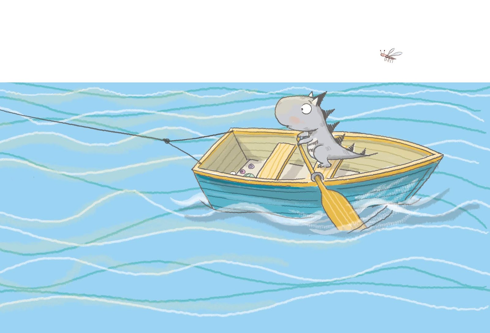 |
| Excerpt from Roo the Roaring Dinosaur: Best Playday Ever! by David Bedford, illustrated by Mandy Stanley (UK: Simon & Schuster, 2016) |
 |
| Excerpt from The Journey by Francesca Sanna (UK: Flying Eye Books, 2016) |
 |
| Excerpt from The Crocodile Who Didn't Like Water by Gemma Merino (UK: Macmillan, 2013) |
 |
| Close up from A River by Marc Martin (UK: Templar, 2016) |
 |
| Close up from There is a Tribe of Kids by Lane Smith (UK: Two Hoots, 2016) |
If you have any thoughts on illustrating water, or know of any great illustration examples, do share. Thanks!
Paeony Lewis
10 comments:
Gorgeous. Makes me want to get out the clingfilm and experiment myself. I have to give a shout out to Charles Fuge - each of his (undersea) bubbles in the Gilberts are mini masterpieces - and Cecelia Johannson's layered tissue paper collages made fab arctic sea backgrounds for a long out of print Tooth Trouble.
Amazing art. That first Sydney Smith spread is one of my all time favorite picture book spreads. But I love everything here.
Inspiring stuff Paeony! It really makes me want to get out and start experimenting more.
Thanks and go for it, Jane! Plus I've just taken a look at my Gilbert book and yes, those bubbles are a delight. Looked up Tooth Trouble too (watched a dodgy video online!) and I wouldn't have guessed tissue was used. At the back of picture books, I'd love it if they told us about the art.
The sun is so bright you can feel the shimmering heat. Thanks, David.
Your art is already amazing, John, though experimentation can be exciting :-)
Thanks for a lovely post. I'mn in awe of illustrators whatever thier style. I'm often asked if I do the illustrations for my picture books. My standard answer is "I wish but I'm just not that talented."
Thanks, Lynne. A tentative desire to try illustrating one of my own picture book texts got me started in art, albeit sometimes I feel it's enough that now I understand more when I visit an art gallery!
Great post Paeony! I think the technique used in The Crocodile Who Didn't Like Water by Gemma Merino is trace monoprint where. I’m sure you’ll know the technique but for anyone reading who doesn’t; you ink up some glass, put your paper over it and draw on the back so that the reverse image side picks up the ink with that beautiful jagged line.
Many thanks and yes, Claire, I'm sure you are right. Well deduced! Very effective.
Post a Comment