
Enthusiasts of picture books will be familiar with the delights that may lie hidden on the inside cover of a hardback book, but endpapers often go unnoticed and uncelebrated. With the help of two renowned picture book designers, illustrator Garry Parsons takes a look at the humble endpaper and uncovers reasons to celebrate them.
Endpapers, also known as ends or endsheets, are the pages glued into the inside cover of a hardback book. The functional purpose of these pages is to hold the book’s interior to its cover and protect the insides of the book. But these pages can also be the source of creative visual delights. A home for maps, patterns and repeats, bold colours or graphic jokes. A space for information about its creators or a place to entice the book owner to add in their own name, the rare occasion when we are permitted to write inside a book. Endpapers can set a scene, form part of the book’s narrative or simply hint at what is to come. So, despite their practicality, these pages can surprise and inspire.

Originally, the endpapers would be white and simply form part of the book’s physical structure, but by the 18thCentury patterns and swirls became popular through the process of marbling or marbleising. Made by floating colours onto a bath of gum or marbleising size, the pattern on the surface of the liquid can be transferred onto paper.
Techniques using combs with varing degrees of spaced teeth could be used to rake the colours on the surface into complicated-looking patterns and swirls. With names like ‘peacock’ and ‘bouquet’, the humble endpaper began a life of its own.


Later, book-makers began experimenting with block printing techniques to add decoration to the end sheets and when book binding became mechanised in the 1830s, the decorative nature of endpapers changed again, becoming ornate with patterns and repeats of floral and animal motifs.
 |
| Block printed endpapers from Anton Michelitz 'Scrutinium Hypotheses Spirituum Animalium' 1782. |
 |
| From a copy of Voltaire's Gospel of the Day 1772-3 |
 |
| The Fairy Tales of the Brothers Grimm illustrated by Arthur Rackman |
 |
| Girl Scout Handbook 1938 |
Influences of the endpaper’s history echo in the repeats and patterns of our picture books today and allow an opportunity for extra artwork from the book’s illustrators and designers.
As an illustrator myself, I enjoy this additional space to be creative and the chance to collaborate with the book designer on what approach might work best. A chance to create an extra level of surprise that will enhance and lift the book a little further. Whilst considering an approach for the endpapers usually comes after the main body of a picture book is drawn up and layed out, the end paper design often feels like an added bonus to tie the whole book together, metaphorically as well as structurally.
In my view, each turn of the page in a picture book should give the reader something unexpected, a visual surprise each time, and the endpapers are no exception.
As a child I remember tracing my finger around the curves of the elephants on the endpapers of Jean De Brunhoff’s adventures of Babar or pouring over the fully rendered scenes of Rupert and his pals in the Daily Express’ Rupert Bear Annuals.
 |
| Jean De Brushoff 'The Story of Babar the Little Elephant' 1934 |
 |
| Rupert. The Daily Express Annual 1973 with endpaper illustrations by Bestall |
So the endpapers to me feel like special creative places where designer and illustrator can merge ideas, where there are few rules and many choices, all held together by a rich tradition and a respected history.
Sifting through the shelves of my collection of picture books, I have looked at the variety of ways they have been used and pulled out a view favourites.
David Roberts has returned to marbling in his compelling retelling of the history of the Suffragette movement.
 |
| Endpapers from 'Suffragette, the Battle for Equality' by David Roberts 2018 |
While Millie Marotta’s endpapers in A Wild Child’s Guide to Endangered Animals and Coralie Bickford-Smith’s endsheets in The Worm and the Bird remind us of the repeated block printing process.
 |
| Endpapers from 'A Wild Child's Guide to Endangered Animals' Millie Marotta 2019 |
 |
| Endpapers from 'The Worm And The Bird' Coralie Pickford-Smith 2017 |
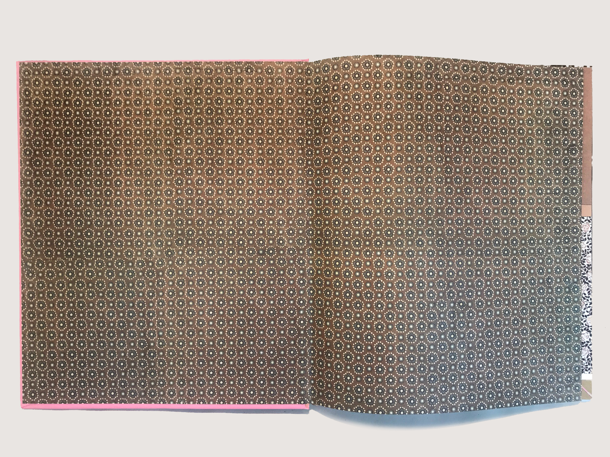
Endpapers can introduce the reader to the characters they are about to meet. Often echoing past printing techniques, these can be monotone and follow the tradition of repetitive wallpaper patterns, as in these examples from Jon Klassen’s hilarious 'I Want My Hat Back' and the informatative ‘Wild Animals of the North' by Dieter Brown and Alastair Humphrey’s ‘Great Adventure’.
 |
| Endpapers from Jon Klaassen's 'I Want My Hat Back' 2012 |
 |
| Endpapers from Dieter Braun's 'Wild Animals of the North' 2016 |
 |
| Endpapers from Alastair Humphrey's 'Great Adventures' 2018 |
The tradition of the wallpaper pattern repeat is used by Lauren Child in ‘Who Wants to be a Poodle, I don’t,’ a book with an interior full of wallpaper-like patterned collages.
 |
| Endpapers from 'Who Wants to be a Poodle, I Don't' by Lauren Child 2009 |
I love the subtle and poetic ways of visual storytelling in the endpapers of 'The Tea Party in the Woods' and 'Lawrence in the Fall'.
These drawn objects taken from the narrative make curious collections, adding surprise and curiosity before reading the book and leaving a space for you to consider them after reading.
 |
| Endpapers from 'The Tea Party in the Woods' by Akiko Miyakoshi 2010 |
 |
| Endpapers from 'Lawrence in the Fall' by Matthew Farina and illustrated by Doug Salati 2019 |
Endpapers are also traditionally the home of illustrated maps like these beautifully clever pages from Peter Sis in his picture book ‘Tibet, Through the Red Box’ and M. Sasek’s comical ‘This is the Way to the Moon’ children’s classic from 1963.
 |
| Beautifully clever endpapers from 'Tibet Through the Red Box' by Peter Sis 1998 |
 |
| Endpapers from 'This is the Way to the Moon' by M Sasek 1963 |
Endsheets can be gloriously bold and abstract as in Eric Carle’s ‘From Head to Toe’ or wonderfully graphic in ‘Professor Astro Cat’s Human Body Odyssey’.
 |
| Eric Carle's endpapers for 'From Head To Toe' 1997 |
 |
| Endpapers from 'Professor Astro Cat's Human Body Odyssey' 2018 |
And endpapers can also act as a space for holding information like the amusing and decorative ‘List of Reasons to Read this Book’ from ‘The Liszts’ or somewhere to assert your ownership in ‘Going to The Getty’ by Otto Siebold and Vivian Walsh.
 |
| From 'The Liszts' by Kyo Maclear and illustrated by Julia Sarda 2016 |
 |
| 'Going to the Getty' illustrated by J.Otto Semibold and written by Vivian Walsh 1997 |
Akin to a clever title sequence from a loved movie or the surprise boldness of an inside lining of a good suit, endpapers in picture books can deliver clever, subtle, elegant and evocative messages and hold a special place for us enthusiasts. I asked two picture book designers and endpaper admirers, Ness Wood and Becky Chilcott, to share their thoughts on what makes a great end sheet and pick out a few of their all time favourites.
Ness Wood has chosen to share an example of endpapers being used as narrative, pure pattern and abstract.
 |
| 'Sparkle and Spin' by Ann and Paul Rand |
Sparkle and Spin by Ann and Paul Rand
I love the graphic quality of these gorgeous endpapers. Originally published in 1957, this timeless classic is such a fun carnival of colour.
The uneven quality of the stripes works so very well indeed.
 |
| Front endpapers from 'I'm Actually Really Grown Up Now' by Maisie Paradise Shearing |
 |
| Back endpapers from 'I'm Actually Really Grown Up Now' by Maisie Paradise Shearing |
I’m Actually Really Grown Up Now by Maisie Paradise Shearring
A great contemporary example of narrative endpapers - setting the scene at the beginning and having the family unit asleep on the ends.
Gorgeous use of colour and composition.
 |
| 'Another' by Christian Robinson |

Another by Christian Robinson
This wordless book is fun, fun, fun! A riot of ripped paper and texture, Robinson is the fabulous creator of these amazingly simple but gorgeous images.
The endpapers show the night sky in all its glory - which is what the little girl can see through her telescope at night. I have also included what is under the jacket- the amazingly brilliant red glory of kids playing - he makes it look so simple!
And here are Becky Chilcott’s choices.
I love the endpapers in a book – from a reader and designer’s point of view. It’s a chance to add something extra to the book that can be narrative, decorative or ideally both and I feel can be somewhere the illustrator can play more freely in terms of style and content. Of course on each book it really varies as to who creates and comes up with the ideas for them – it can either be the designer or illustrator and is more often than not a collaborative effort.
I love the possibilities of coming up with ideas for endpapers along with choosing things like head and tail bands and cloth colours for the book’s binding – it’s like putting the final touches on a cake and adding the cherry on top. I think it’s just as important to pay attention to these details as it is the whole package that the reader experiences – not just the cover and story inside. By paying as much attention to these details, you can make their experience richer.
As a reader, I love picking up a book for the first time, opening it up – and the endpapers are often the first thing you see. If they’re illustrated rather than a plain coloured paper, it feels more inviting and is a visual signpost to the contents within, leading you to a new world waiting to be explored . . .
 |
| Endpapers from John Burningham's 'Borka' |
Borka by John Burningham
I adore this book – John’s illustrative style is so free and playful, I feel like the characters are about to flap off the page! The endpapers set up the story so simply and clearly here by indicating that Borka is different from the rest of her siblings and it makes you curious as to what happens to her in the rest of the book. The limited colour palette is gorgeous too – I wish I could hang this on my wall.
 |
| Front endpapers from 'Little Mouse's Big Book of Fears by Emily Gravett |
 |
| Back endpapers from 'Little Mouse's Big Book of Fears by Emily Gravett |
Little Mouse’s Big Book of Fears by Emily Gravett
These endpapers are stunning. I love that they reference the traditional nature of endpapers with a decorative pattern – but comprising of things that people are afraid of – combined with narrative elements from the story – showing Mouse, looking scared, leading us into the book holding a pencil, along with the torn paper instructions for the book and die-cut hole from the cover. I really like that the endpapers at the back reference the ones at the beginning with the same pattern but showing Mouse looking relaxed and happy in the nest of all the bits of paper that have been nibbled from the book. It finishes off the story perfectly.
 |
| Endpapers from Little Golden Books |
Little Golden Books
The endpapers from the Little Golden Books series were designed to featured in each book in the series and showcase characters that can be found within the different books. I love the typography, pattern, colours and whimsy of them – they fill me with nostalgia and I like that they aren’t too perfect with the series logotype falling over some of the illustrations or getting too close to them, which is something I would probably never consider doing today!
Ness Wood is a respected freelance book designer and
Becky Chilcott is a freelance graphic designer and the curator of the events programme at the St Bride Library in London.
Garry Parsons is an illustrator of many picture books and an enthusiast of endpapers. You can see more of his work at garryparsons.co.uk
10 comments:
Yes! End papers are an extra treat! My favourite to date are the endpapers in Jackie Morris's Tell me a Dragon.
Loved reading this.
Thanks Garry. So many beautiful examples here and many I've not heard of. I'd better get exploring! Lucy Rowland
Loved this post! I enjoy watching children get absorbed in endpapers.
Garry, I think you'd love this Youtube showing the great book binder and marbller Sandy Cockerel creating his swirly papers back in the 1970s. As a child in Grantchester, I was lucky enough to visit that workshop and have a go with stroking combs through paint suspended on seaweed water. Magic! My big brother was interested in book binding, and I got to go along too. Lucky lucky me!
See -https://www.youtube.com/watch?v=Vyga8VMWXKg
A wonderful post, thank you.
Wonderful post. Thank you for sharing these beautiful, underappreciated pages.
Do any readers know if there exists a book simply filled with examples of endpapers. Classic and beautiful... pre 1950s ?
Loved reading this article and my what a treat of end papers in books!
While indulging in this visual delight, I couldn't help but contemplate another fascinating topic that has been making waves in the financial world - Dogecoin! As a cryptocurrency enthusiast, the question that often surfaces among investors and followers of this digital asset is, "Can Dogecoin Reach $100?"
While I'm not an expert in cryptocurrency predictions, it's essential to recognize that Dogecoin's journey has been one of the most captivating narratives in the crypto space.
What an intriguing blog post on the unique story of endpaper artistry! As an avid reader and lover of picture books, I appreciate the often-overlooked artistry that graces the inside covers of these literary gems. The fusion of creativity and storytelling in the endpapers truly adds a magical touch to the reading experience.
How to Find Dead Airpods
Post a Comment