
 |
| Hannah Höch Picture Book (The Green Box, 2012) |
Below you’ll discover lots of illustrations that have piqued my interest (scanned with my slightly dodgy scanner – apologies) . They’re from children’s picture books I've bought in 2014. There’s something about each illustration that has grabbed my attention from the point of view of a fledgling artist (very fledging – I’ve only just hatched). I admit it’s a personal list and my choices reflect the direction of my own art. Even so, perhaps I’ll inspire you to look again at illustrations.
 |
| Hannah Höch Picture Book (The Green Box, 2012) |
My first choice is a little eccentric. It's a book produced in 1945 by the only woman in the German Dada art movement, Hannah Höch (1889-1979), and a pioneer in collage. Not even seen by the public until 1975, her children's picture book has been republished and as an adult I find her collages compelling and bursting with fun, although I ignore her whimsical rhymes.
Returning to 2014 and in Suzanne's Barton's The Dawn Chorus there's a subtle integration of paint and collage. What caught my eye was the use of collage in the leaves, feathers, musical notes and curling lines of song.
 |
| From The Dawn Chorus by Suzanne Barton (Bloomsbury, 2014) |
In another mixed media book, Just Right for Two, Rosalind Beardshaw uses collage in a similar way in the leaves, plants, trees, and even to divide between a few illustrations (good idea). Plus I like the teasing silhouette of the mouse - lovely visual foreshadowing.
 |
| From Just Right for Two by Tracey Corderoy & Rosalind Beardshaw (Nosy Crow, 2013) |
In The Haunted House, Kazuno Kohara produces simple mixed media images to eye-catching effect. I assume she has used black ink printing on orange paper and added tissue overlays. I love it, and the original story too.

 |
| Two images from The Haunted House by Kazuno Kohara (Macmillan, 2008) |
The next book is the opposite of simplicity: Bear Hug by Katharine McEwen. I'm not an expert, but to me she appears to use harmonious colours in a similar tonal range to bring together detailed stylised images. Even though it's visually busy, I'm drawn to the illustrations and the snowflakes are a lovely touch. Plus I've been thinking about the portrayal of water in art and I find the wavering blue lines of the stream appealing (a Hockney influence?).
 |
| From Bear Hug by Katharine McEwen (Templar Publishing, 2014) |
Several illustrations in Mr Tiger Goes Wild by Peter Brown also use lines in an interesting stylised way to illustrate the movement of water. I particularly like the sketchy spirals of 'foam'.
 |
| From Mr Tiger Goes Wild by Peter Brown (Macmillan, 2013) |
Whilst in The Best Book in the World by Rilla, the movement of ocean waves is cleverly shown by the curve of the sea creatures. This book also has gorgeous bold endpapers - I'm a bit of an endpaper groupie!
.jpg) |
| Above image from The Best Book in the World by Rilla (Flying Eye Books, 2014) Plus marvellous, dramatic endpapers below in the hardback edition |


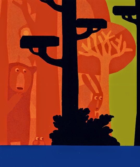
I can't resist showing one more example of water. This time it's from the huge A Lion in Paris by Beatrice Alemagna. Vertical broken white lines effectively simulate rain.
 |
| Above and below, A Lion in Paris by Beatrice Alemagna (Tate Publishing, 2014) |
Other inventive ideas are found in the 'arty' A Lion in Paris and I adore the stylised map, collage, and tissue (?) overlay clouds which feature in the excerpt below of a 'lion's eye' view of Paris (I can't show the whole page because the picture book is almost A3 and won't fit on my scanner).

Another artistically innovative book is the Yes. Written by Sarah Bee and illustrated by Satoshi Kitamura. The main character is an orange blob creature called 'the Yes' who wants to escape 'the Nos'. I was transfixed by some of the almost semi-abstract illustrations that reflect the semi-abstract concepts of 'yes', 'no' and a place called 'Where'. Even with the huge blocks of colours, there is enough realism for the book to be easily understood by a child (and adult too - we're not always as visually literate as children!).
 |
| From the Yes by Sarah Bee & Satoshi Kitamura (Andersen Press, 2014) |
A bold use of shape and colour is also seen in the contemporary, but more conventional Where Bear? by Sophy Henn. Strong contrast and simplicity bring alive the friendship between the bear and the boy. Plus the endearing endpapers of the hardback always make me grin. My only niggle in this book concerns the commas, or lack of them. I want to add a comma after the 'where' whenever I read lines such as: "Then where bear?" asked the boy. I even want to add a comma to the title! Anyway, I still adore this delightful book and I'm not supposed to be discussing the words.
%2B(2).jpg) |
From Where Bear? by Sophy Henn (Puffin Books, 2014) with excerpt from hardback endpapers below

The use of white was particularly eye-catching in Where Bear?, whilst it's the traditional artist's red that is used in the painterly The Journey to draw our eye to key images in the beautiful illustrations (a red crayon, door, boat, air balloon and magic carpet). This is a wordless story by Aaron Becker and therefore being able to interpret the narrative of the paintings is essential - without the touches of red we might be confused.
 |
| From The Journey by Aaron Becker (Walker Books, 2014) |
Red is also used in another book: Very Little Red Riding Hood by Teresa Heapy and Sue Heap. In this story it's obvious why red is important, although here it's used in a fun way to emphasise objects belonging to the little girl such as the teddy bear, hair clip, bag and flowers. The page below also illustrates the delightful use of vignettes to show actions and the passing of time in a restricted space. Plus I like the loose lines and flow of these drawings. Oh, and the endpapers have a red and white map of the route to Grandma - I'm a map groupie too!
 |
| Very Little Red Riding Hood by Heapy & Heap (David Fickling Books, 2013) |
Another way to use colour to guide our interpretation of a story can be seen in The Wonder by Faye Hanson. Here, sephia tones indicate the everyday mundane world of the boy, and in contrast bright vivid colours are used for the boy's fantasy world. Below is an early glimpse of the fantasy world before full colour takes over entire pages.
 |
| From The Wonder by Faye Hanson (Templar Publishing, 2014) |
 |
| From Roo the Roaring Dinosaur by David Bedford & Mandy Stanley (Simon & Schuster, Jan 2015) |
 |
| From A Bit Lost by Chris Haughton (Walker Books, 2011) |


14 comments:
Yes, you have inspired me to look further into the art of picture books. :) And I look forward to seeing Picture Book Den member's forthcoming 2015 books.
Very glad that I popped in to PBDen during an uinexpected catering gap today. What a treasure of a post! Thank you very much, Paeony!
That's great, Christie :-)
Hurrah! I'm glad you popped in too, Penny. I was starting to worry because it was so quiet. Not a good time of year for a blog post! x
Thank you, Paeony! What visual treats and food for thought. Inspiring as we head to a new year.
I'm no artist but I do love art (part of my degree was art history) and it always amazed me we never covered this as a topic (especially as just down the corridor from us was the art department who run a book illustration course). It's a genre that has some fantastic artists creating wonderful pieces but people seem to overlook them because they are part of a book. Stick a frame around some of the above images and I'd put them on my wall.
What a treat, Paeony. Looking at these fabulous examples (what lucky children to own these) I seem to see a distinct retro feel, harking back to the 50s and 60s, especially the use of a limited colour palette and strong shapes. Those in turn harked back to Japanese prints, I think. Taste in illustration changes, of course, and it's often possible to date a picture book from its illustration style.
Many thanks, Pippa, Lynne and Moira. I agree, Lynne, that illustration doesn't always seem to get the recognition it deserves in the art world, although more and more places sell the originals and prints of illustrations, so perhaps it's changing? And Moira, the choices reflect my taste and I'm rather partial to retro! Mind you I wonder if the retro style is in danger of becoming a cliché because nowadays the majority of 'arty' picture books feel retro, albeit they're still my preference.
Does anybody have any books they can suggest that are good examples of art styles they enjoy?
Wow, thanks for the visual treat, Paeony. I really enjoy Eric Carle's style, which is standing the test of time, too.
Thanks, Jane. I'm glad you mentioned Eric Carle - I debated including his Brown Bear book as I'd bought it this year (even though it was published long ago). I adore his collage-type animals. Another illustrator that I think still looks contemporary and innovative is Brian Wildsmith.
Great Post, Paeony,
I did a deep dive into picture books last year, reading them almost exclusively (outside a couple novels and nonfiction things) There is a lot to explore, and when I review picture books at
"Talking Animal Addicts" I try to give as much attention to the illustrations as I do the writing, especially since I'm a text only writer, but I strongly believe even non-illustrators have a good eye for visuals, and being into art history as a kid helps in this.
One of my favorite illustrators is the late and great Fred Marcelino, he mostly illustrated books by other writers, including two of my favorite novels "A Rat's Tale" and "The Wainscot Weasel" both written by Tor Seidler. His picture book "I, Crocodile" (which is one of my first serious book reviews) is the only books I know of which he wrote and illustrated, and anyone who loves Jon Klassen's "I Want My Hat Back" I URGE you to hunt down a copy as it's sadly out of print, but see if your library has an old copy.
Happily "The Wainscott Weasel" was reisued last year and it's great story first and foremost, but it's one of the most gorgeously illustrated middle grade novels I've ever read in the past decade, and I don't say that lightly.
(I even made a fan book trailer for it to celebrate it's reissue and the 20th anniversary of its original publication!)
Take Care,
Taurean J. Watkins
Hi Taurean, I've just been looking at your blog (aptly named!) and the Fred Marcellino books, and in particular 'I Crocodile' (I used Amazon's look inside feature). Plus yes, the cover of The Wainscott Weasel is gorgeous. I always enjoy discovering authors and illustrators who are new to me - thanks so much. To me, Fred Marcellino appears very different in style to Jon Klassen ('This Is Not My Hat' is a huge favourite), although they do appear to share a mischievous streak ;-)
Thanks again! Paeony
Yes, in art style they're very different, I meant in terms of the story and mischief in the central character, in Klassen's story the bear, and in Marcelino's the crocodile named Napoleon. I just didn't want to spoil the ending of "I, Crocodile."
Oh, and thanks for stopping by T.A.A., Paeony. I love highlighting new or hidden gems to balance out the inherent attention the well-known "classics" get.
Post a Comment