
As an
illustrator amongst a gaggle of writers I guess I'd better post something about illustration. So here goes.
I'll
write about influences, subject matter and how I came to be doing
what I do another time, OK? If you don't know my work, (gasp! is such
a condition even possible!?) I draw appealing, funny animals in a
simple 'cartoony' (for use of a better word) style.
Today I'm going to talk about my drawing process and how it came about.
This
is a rather ropey but fun little video I put together of my current
process in action. Dig the music ;-) Sorry it ends rather abruptly,
this vid making lark is a bit of a learning curve.
Some
history - I started off drawing simple outlines of said funny animals
and background trees, windows etc, truncated by the edge of the
frame. Colouring the resulting shapes with flat poster paints in
bright colours straight out of the pots. It looked quite nice, in a
bold, abstract, graphic sort of way, and I got a commission to do a
couple of cards for Gallery Five in this style while I was still at
college, which was encouraging.
 |
This
kind of thing, though these were done a few years later
|
But
this flatness became very limiting, so by a process of good old trial
and error, the flat colour evolved into a more subtle
watercolour/gouache wash in naturalistic colours over/under the same
simple outlines.
This
was pretty good, but not quite right, so by dint of further trial,
error and evaluation, the addition of cross hatching with a finer pen
- to help define form and texture, was settled on. This worked well
and after a touch more refining, became my 'style'. Phew. . .
 |
This
was one of my first illustration jobs, for Gallery 5
|
My
procedure was this, I started off with a pencil rough, which I either
copied or traced onto artboard. I added wash to that, then, when it
was dry, I drew a pen outline using the ubiquitous Rotring pen. I
then added the cross hatching using a thin version of said rotring
pen. This was Ok but the pen would clog frequently, as anyone who
used rotrings and their ilk would affirm. Still, it worked and was
successful so this was my preferred method for years.
 |
From
my first picture book, 'Guthrie Comes Clean',
published by J.M Dent,
way back. .
|
Until
the mid nineties. . . drum roll. . . swiss roll. . . iced bun. . .
It was
then that I became attracted to the idea of using a computer to make
my artwork on, as this had just become possible at a more or less
consumer level. I didn't want to use it to make computery looking
fancy stuff, (that was SO naff, even then) but to draw and paint
directly into the computer in my usual style, using a graphics tablet
and a bit of software called Painter, which imitated 'natural media'
such as water colour, digitally. It sounded interesting, and, well, I
just liked the idea for some reason.
So I
took the plunge and bought a Mac (a 7100 I think it was called. I
still have it in the attic. No idea why. . . ) a Wacom tablet and
some software, and thus equipped, set to work learning how to use it
all. It was fun actually. I like working things out. Usually. My work
is essentially coloured-in drawings as opposed to painterly creations
utilising the characteristics of the medium, so the computer could
get pretty close to my fairly unexpressive line and wash style.
 |
From
'Fowl Play' one of the first books I did on computer for Orion
|
The
advantages were that unlike 'real' artwork, everything was editable.
I could change the size of things, tweak the colours and thickness of
line, etc., which was great, especially when working out page layouts, etc. Also, artwork didn't need to be scanned, which was nice for me
because it always annoyed me that a scanner would show pencil lines
that as far as I was concerned had been erased as they were invisible
to the naked eye. Publishers always defended this by saying that the
scanners were so 'good' that they picked up everything. A strange
definition of the word 'good' I always thought. So good they can pick
up things you can't even see! . .. fah!
The
disadvantage was that nobody in the publishing industry knew what the
heck they were getting or what to do with it. I wasn't exactly an
expert either. The main point of contention and concern was that as
the artwork only existed on screen, the colours varied according to
what screen it was being viewed on. Calibration was important.
Everyone had to be confident that they were seeing the same colours
as each other as there was no actual bit of artwork to compare the
printers proofs to.
I
wasn't ever so popular ;-) But we got there in the end. The
publishers and printers knew that the repro industry was well on it's
way to being digitally led and that they had to adapt.
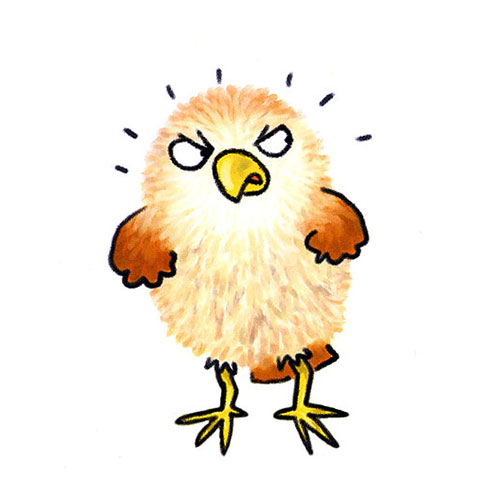 |
Baby
Owl, conceived and created on computer
|
I've
worked on computer ever since. A lot of artists now scan their work
in and modify it in Photoshop. And a lot of artists use Adobe
Illustrator, which lets them produce resolution independent images,
funnily enough using flat colours and simple outlines like my ancient
poster paint images did. It's just normal now but I remember those
pioneering days. . . One day I shall sit my grandchildren round the
fire and tell them tales of the days when men were men and a megabyte
was something significant. And they will fall asleep in seconds flat.
. .
13 comments:
Fascinating! I'd no idea it was possible to work so directly onto a computer without it looking computer. Was Guthrie named after Arlo?
Really enjoyed discovering the computer genesis of your art style. 'Behind the scenes' is always interesting, and with so many of us on this blog being writers, it's great to have a contrast. Thanks!
Thanks Pippa, no the Guthrie didn't come from Arlo, (or Gwen, the reggae singer) I really don't know where that name came from, especially as a first name. It just suited the character ;-)
So that's how you do it!
So am I the proud author of the only non-animal Jonathan Allen-illustrated book, by any chance? Is it a rare and special thing? 'Hair Scare', remember?
Really interesting to read how the way you illustrate evolved, love the video, too.
I do remember 'Hair Scare' ;-) That was a fun book to illustrate. I haven't done many non animal books, that's for sure. None written by me. There's a Margaret Mahy book I illustrated about a boy who looked like a shark, but that's only half non animal. . . So you are in a select minority for sure Malachy.
Good to see your work here Jonathan. My very first book was for A & C Black way back in 1982 and they gave me a copy of one of your titles they're just published as a format guide. I kept the book for years, it always sticks in my mind!
Brilliant to read about how another children's book illustrator works (especially as the manual-to-digital artwork journey is similar to my own!)
Thanks John,
I think I only published one book with them. It must have been one of the first things I had published. Was it 'The Trouble with Animals' by Jeremy Strong?
Glad you enjoyed it Paeony ;-)
Thanks Jane ;-)
Thanks Cathy, its hard to know how interesting to others my own concerns actually are. I don't want to be boringly self indulgent. Glad you enjoyed it. I feel reassured ;-)
Thanks Jonathan - this was a really interesting insight into your process. Illustrators I know vary widely in the way they use the computer - it sounds like such an amazing tool for image work. One of my friends draws by hand, then scans in, prints out and paints on the scan, then re-scans to touchup. Someone else does line drawings by hand but then all the 'colouring in' on the computer. I really liked hearing how your style has evolved (and the funky music!) :)
Post a Comment