Showing posts with label Paeony Lewis. Show all posts

Monday, 7 October 2019

That's a lot of blog posts on writing and illustrating children's picture books • Paeony Lewis


Wow, I've been blogging at the Picture Book Den since it began almost eight years ago, but now that I've started an MA in Fine Art it's time to take an extended break. So to say farewell, I thought I'd list my main blog posts (see further down) and do click on those that appeal. They're on writing, illustration and the world of children's picture books.


The statistics on the viewing figures for my different blog posts intrigued me. I discovered the blog post viewed the most was on the picture book differences between bookshop chains in the US and UK. This was written in 2016 and had several thousand more views than my least popular post (that's a secret!). I suspect the viewing figures increased because of the US reference (there's many more of you in the US than UK).


If you're new to writing picture books then perhaps begin with the 2018 Starting to write picture books and also What's at the heart of a picture book?,  which although written in 2013 includes vital advice that is often forgotten.

As for my personal favourite, well of course I'm going to say it's impossible to pick one but... My blog post on the convoluted journey of one particular story still makes me smile and I hope it encourages others to persevere with their writing. I also really enjoyed looking at illustration, such as investigating dioramas and 3D illustration in picture books.


List of Blog Posts (newest first)
I'm really going to miss being a regular part of the wonderful Picture Book Den. Thank you to all my brilliant fellow writers and illustrators, and all you lovely readers.
Bye for now, Paeony
PS I'm still writing, when not enmeshed in book arts and conceptual art.

For books: www.paeonylewis.com
For art: www.paeony-lewis.com

    Monday, 22 April 2019

    Dioramas and 3D illustration in children’s picture books, by Paeony Lewis

    For centuries, dolls’ houses have encouraged children’s imaginations and story telling. Toy farmyards, zoos, soldiers and train sets, even Playmobil and Lego, can also be used to create miniature imaginative worlds. Children’s television was once full of 3D models: Thomas the Tank, Fireman Sam, Clangers, etc. So I am surprised there aren’t more children’s fiction picture books that use dioramas and 3D illustration, and I thought I’d investigate.

    From a dolls’ house exhibition (my own dolls’ house was nothing like this!).
    Traditional illustrations create imaginary worlds, but there is something about a miniature 3D scene that draws me in and makes me smile. I am sure I’m not alone (am I?) and I wonder if some children could relate better to a photographic 3D image as it’s so similar to what they see on screens. Or is there a hidden reluctance amongst adults and publishers towards books that look more like television, unless they are already a television series? Alternatively, perhaps most 3D artists/illustrators already work with moving images for the screen, rather than books?

    The television world of the Clangers
    Another explanation for the scarcity of 3D models and dioramas in picture books might be that they are very time consuming to create and require photography and model making or papercraft skills, in addition to illustration. For example, Antje Damm, who has created several lovely diorama picture books, commented online: “I am not a very good photographer, and this was my main problem while creating this book.” Whilst Lauren Child used a professional photographer, Polly Borland, for her two delightful 3D diorama books, and the first, The Princess and the Pea, took almost two years to complete, compared to the usual three-six months for her picture books. When it came to her second 3D book, Goldilocks and the Three Bears, this time a set designer was also used, Emily Jenkins. Lauren Child comments on her website: “As much as I enjoyed designing and building sets and styling scenes, I must say I was relieved that this time it wasn’t my job.”

    Whatever the reason for the scarcity of fiction picture books that use 3D dioramas, I thought I'd share some delightful examples. I'll begin with an appealing American one I’ve only just discovered, that is aimed at younger children: Hank Finds An Egg by Rebecca Dudley (with a name like Hank, I doubt I needed to mention it’s American!).

    Hank Finds an Egg by Rebecca Dudley (Peter Pauper Press Inc, USA, 2013)
    This was Rebecca's first picture book and as an architect she was familiar with working in 3D. It's wordless and the theme of kindness and perseverance shines through the simple-to-follow visual story about a monkey who tries to return an egg to a nest. Rebecca also trained in graphic design, and the uncluttered layout and quiet natural colour palette add to the book. There are many more images on Rebecca's blog.


    From Hank Finds An Egg       Everything is handmade, including all those leaves, and then photographed. 
    The same US publisher, Peter Pauper Press Inc, is behind a further 3D book, this time creating 3D paper-cut dioramas. Published in March 2019, I haven't yet seen Little Things by Nick Dyer, illustrated by Kelly Pousette. Years ago, the illustrator was given a book on paper cut and says she became fascinated by the process. She is particularly interested in the shadows and lighting that are possible from photographing the scenes.


    Kelly Pousette in her studio (from Letstalkbooks blog post)

    The next American 3D book is another I haven't seen, Viva Frida by Mexican-born illustrator Yuyi Morales. There are few words, though perhaps this should be classified loosely as non-fiction as it is about the creativity of artist, Frida Kahlo. This vibrant award-winning book appears to be Yuyi Morales' only book that uses 3D models, as her other books are traditionally illustrated. In this video she talks about how time consuming it was to create a book from models and scenes. Interestingly, like Lauren Child, Yuyi Morales used a photographer for her 3D scenes (Peter O'Shea).

    Viva Frida by Yuyi Morales (Roaring Book Press, USA, 2014)
    Inside Viva Frida by Yuyi Morales


    Moving across the ocean to the UK, as mentioned earlier, Children's Laureate, Lauren Child, is behind two gorgeous 3D picture books. In the first, The Princess and the Pea, Lauren Child both wrote and created the scenes, ready to be photographed professionally by Polly Borland. The figures are painted 2D cut-outs and the backdrops are 3D dolls' house furniture or specially commissioned items. Many of the panelled rooms started life as cornflake packets. Not everything is to scale, as happens in a real doll's house, and Lauren Child feels this creates a stranger, more childlike world. In the book, she writes: "I love the paintings of Vermeer, his detail and the way he allows you a glimpse into someone else's world." This, and her passion for dolls' houses and use of collage in her books, must all inspire the dioramas in Lauren's quirky retelling of The Princess and the Pea.

    The Princess and the Pea by Lauren Child,
    photographs by Polly Borland (Puffin 2006)

    Creating a scene, from The Princess and the Pea

    Lauren Child's personal doll's house, that took thirty years to create.  More here.

    From inside The Princess and the Pea


    When Lauren Child and Polly Borland partnered again on their second 3D book, Goldilocks and the Three Bears, they decided to use dolls and teddy bears because Polly Borland's favourite book as a child was the American photographic picture book, The Lonely Doll by Dare Wright. Since it's publication in 1957, it has caused controversy because of the bear's worrying penchant for smacking, but it remains an iconic book and he published many others using the same realistic photographic 3D techniques.

    From The Lonely Doll by Dare Wright (Houghton Mifflin 1998 reprint of 1957 original)

    Again, Lauren Child twisted the story of Goldilocks and the Three Bears, but this time she didn't personally produce the time-consuming hand-built sets, and instead passed this to Emily Jenkins. Polly Borland remained the photographer. The three bears and Goldilocks were created by doll-maker, John Wright, and Goldilocks stands 30cm tall. Personally, I adore studying the fantastical, intricate photographic 3D illustrations.

    From inside Goldilocks and the Three Bears by Lauren Child and many others (Puffin, 2008)

    This photograph from the making of the book gives a sense of scale.
    In reality the trees are young.
    Another illustrator I really enjoy who produces dioramas is the German illustrator, Antje Damm. I've even bought one of her books that hasn't been translated into English, which is slightly daft as I don't read German - here it is (can anyone translate the title for me?!). Looking through a book when you can't read the language reminded me what it must be like to be a child faced with a mass of alien words, trying to create a story from just the images.


    Like Rebecca Dudley, Antje Damm also studied architecture and therefore was proficient at visualising in 3D and making models. I first bought Antje Damm's Waiting for Goliath because of the interesting illustrations that were a mixture of stand-up 2D and 3D paper/card models, and the strong colour scheme. It looked different to the other books on the shop shelves.


    Waiting for Goliath by Antje Damm (Gecko Press, 2017)

    From inside Waiting for Goliath

    With a few changes, the model above was used to create the image in the book.
    It's interesting what can be done with lighting and photography.
    For more info see this blog.
    The Visitor (Gecko Press, 2018) is probably Antje Damm's most well-known book in the UK. Here, all the story takes place in one ground-floor room and it is about loneliness and overcoming fears. Again, the book is in her distinctive 3D style and Antje uses variations in colour and lighting to show the development of the story. For the last scene she took the model outside because Antje wanted the warm light of the sun and enjoys experimenting.

    Antje Damm experimenting with lighting the diorama.
    From inside The Visitor by Antje Damm (Gecko Press, 2018)
    A torch provides different lighting effects
    Variations in lighting played a major role for another illustrator, Elly MacKay, when she created the diorama images for Maya. Canadian illustrator, Elly Mackay, worked with Indian-born author, Mahak Jain, to create a book that combines reality with the fantastical and a dreamworld. This wasn't Elly's first paper-cut, 3D book, but she said it proved the most challenging. Online, we are told she creates the illustrations by inking synthetic YUPO paper and cutting it into layers that are set up like a Victorian paper theatre, and then she plays with lights and filters to create atmosphere and photographs the scenes. There's a video here on the making of the book, including collaboration between the author and illustrator, which isn't often allowed to happen in publishing.

    Maya by Mahak Jain and illustrated by Elly MacKay (Owlkids Books, 2016)

    Elly MacKay creating Maya


    The images above from the pages of Maya show how Elly MacKay utilised lighting and different techniques. She says the dreamworld uses only black and white, with shadows and fluid, dreamy lines and otherworldly lighting.  The real world is crisper, rigid and clearly three-dimensional.

    There's more on the creation of Elly's award-winning 3D paper cut diorama books at her website. The image below is from her 2018 book Red Sky at Night, and shows the photography of a scene within one of her 'theatres'.

    As I've been putting this blog post together, apart from appreciating how staggeringly time consuming the books are to create, I've come to realise how integral photography and lighting are to the images. Some illustrators use professional photographers, and others learn as they develop their skills. All the illustrators here say they use minimal post-production digital computer manipulation, if at all, and Rebecca Dudley says it might only be to remove a pin holding up a model.

    Lauren Child deliberately mixes the sizes of objects, as you'd find in a doll's house, and not reality. I enjoy this as, for example in the delightfully quirky The Princess and the Pea, the juxtaposition of 2D paper figures and 3D miniature objects makes it clear this is an imaginary world. From a positive point of view, Antje Damm's dioramas are also clearly not real, which I like. For me, sterile perfection and seamless minaturisation would detract from the make believe of the storybook world because it leaves less psychological space for the reader's own imagination. Thus perversely, intricate perfection would be more unreal (maybe others disagree?).

    Part of the charm of dioramas, whether paper-cut or models, is to feel you are stepping inside a world/theatre of the imagination, not reality. It's like discovering a fairy door on a tree in a wood. You know it's not real but your imagination takes you on a journey of joyous make believe. Now I want to create a 3D story about one of those doors, and where it leads!


    Paeony Lewis
    Please click for more of my blog posts at the Picture Book Den

    Monday, 11 February 2019

    Illustrating Water in Children's Picture Books • Paeony Lewis

    I adore staring out at the sea, but at this time of year in Norfolk (England) it's too cold to look for long at a grey North Sea (the lumps on the beach are seals, not afraid to bask in the frigid wind). So inside my warm home, I thought it would be intriguing to look at a few illustrations of sea and water in children's picture books, especially as I want to try illustrating the sea.


    Looking harder at illustrations is always fun (in my opinion!), although sometimes I am stumped at how the artwork was created. For the first image, I'd never have known if the information hadn't been inside the book.

    Excerpt from The Hidden Forest by Australian author and illustrator,
    Jeannie Baker (UK: Walker Books, 2005)
    The kelp was modelled with translucent artist's clay and the seawater is resin.

    In The Hidden Forest I assume the lighting used in the photography mimics the natural reflection of light? However, sometimes simple paint can have the same impact, as seen below in Town is by the Sea.

    From Town is by the Sea by Joanne Schwartz, illustrated by Sydney Smith (UK: Walker Books, 2018)
    This is the bright, blinding, shimmering sea.
    Throughout the book there are many gorgeous, deceptively simple, atmospheric renderings of the sea.
    It can be easy to forget how much artistic effort goes into good picture books. I discovered a video where illustrator, Sydney Smith, ponders the illustration of this award-winning book and I thought some of you would be interested in the detail, so here goes…

    From childhood, Sydney was familiar with the coast and for the book he visited the mining town of Glace Bay on the eastern tip of Nova Scotia, Canada, to “feel the size of the sea”. He viewed exhibitions too and for the water he absorbed the expressive brushwork of Turner, and the French Impressionists.


    From Town is by the Sea, another illustration of the sea by Sydney Smith.
    The quiet sea.
    Sidney’s principal tip on painting the sea is to decide on the type of sea. In the book there is the bright, blinding, shimmering sea, a choppy sea, a quiet sea, and a dark sea. Then Sidney suggests becoming the motion of the sea with your brush, “dance with your brush,” and don’t worry about detail because the sea is always moving. Be expressive.

    Traditional watercolour is used for Town is by the Sea, along with Pentel brush pens and gouache paint (akin to watercolour mixed with chalk) used dry for the white frothy tips of the waves and the light. Sidney paints multiple versions of the sea double-page spreads, and then he keeps the one that seems to be going best. I suspect this is because although a lot of advance planning is needed, the watercolour is fluid and fast-drying, and so much depends on the specific brushstrokes.


    Here is detail from the bright, shimmering illustration by Sydney Smith.
    You can see the individual expressive brushstrokes
    and the white gouache applied over the watercolour.
    For the next illustrator, I could only find out that she includes collage in her illustrations. Victoria Semykina is a Russian artist, currently living in Italy. Looking at her picture book illustrations in The Real Boat, I suspect this new illustrator creates her own papers to use in collage (rather like Eric Carle, creator of The Hungry Caterpillar, fills drawers with his painted paper and tissue, ready to be collaged in future books).  In addition, it looks like Victoria overpaints with watercolour or gouache and draws with oil pastels, but I am only guessing and I am sure she  manipulates the 'collage' digitally. Does anybody know more? For me, it's Victoria's stylised, patterned illustrations that make this book .

    From The Real Boat by Marina Aromshtam,
    illustrated by Victoria Semykina (UK: Templar, 2017)

    From The Real Boat, illustrated by Victoria Semkina

    A close look at an excerpt of waves by Victoria Semykina
    (and see Hokusai's wave later in this post - more inspiration?!)
    Does Victoria scan the painted collaged paper and then layer digitally,
    allowing some translucency?

    The next book is also the first by a new illustrator, and his award-winning book amazed me as it was all done with simple crayon, which gives it a contemporary retro look. If you saw my feeble efforts with coloured crayons, you'd understand my admiration.  It's the narrative non-fiction children's picture book, Shackleton's Journey by young artist, William Grill. Here the white froth of the wave crests and light is simply white, uncrayoned paper.

    From Shackleton's Journey by William Grill (UK: Flying Eye Books, 2014)
    More from Shackleton's Journey by William Grill
    Churning, great waves, and we know they are enormous from the size of the boat..
    If you linger and stare at the illustration above, you'll see how there is 'simply' white blank paper separating blue directional lines of crayoned blue, but it's really effective. In an interview William says, “I try to work as loosely as I would in a sketch book… I’ll do it again and again until I’ve got it right, so it looks like I’ve just sketched it quickly.”

    Even if you are a world-renowned illustrator, sometimes you discover an Achilles heel, and drawing churning water flummoxed French-born artist, Tomi Ungerer. In a video Tomi talks about Fog Island (then called Fog Man), and near the end discusses his path to solving the problem of the waves.

    Tomi Ungerer, talking about Fog Island.

    From Fog Island by Tomi Ungerer (UK: Phaidon Press, 2013)
    Tomi explains how all his life (born 1931) he had a hard time drawing waves, despite during his later life living by the sea in Nova Scotia, and then on an Irish island. It was with the above illustration for Fog Island that Tomi developed a new technique. When he first attempted the waves Tomi was inspired by Hokusai's wave, but he was told his interpretation lacked movement and looked frozen.

    Hokusai's wave
    So Tomi Ungerer persevered and developed another technique. You might be able to see in the video image that Tomi uses semi-translucent transfer paper and he explains how green pastel was applied to the back of the transfer paper and pencil and gouache to the front, with extra, darker pastel where necessary. I was a little confused with the explanation, but that doesn't matter because what is inspiring is that an acclaimed artist experimented until the problem was solved, even though he was in his eighties. It was the same with the fog; Tomi assumed covering the drawing with light grey pastel would give the effect of fog, but discovered it wasn't that simple because real fog plays with perspective and he adapted that technique too.


    Poignantly, whilst researching Tomi Ungerer, I discovered this maverick, acclaimed artist had died the day before, aged 87 years. My heart lurched.


    Another acclaimed, award-winning artist, Leo Lionni (also now departed), used a very different technique for water. I've only just discovered Swimmy by Leo Lionni, and it is now a new favourite, despite being first published in 1963. I first heard of this book through reading Eric Cale and Lane Smith praising the book and it has been recently reissued in the UK. Leo was an artist/graphic designer who didn't start producing children's books until his fifties.


    Swimmy by Leo Lionni (UK: Andersen Press, 2015)
    The cover is shown large so you can see the texture of the water.
    I gather Leo Lionni used a variety of mediums and for this book he used different stamps and printing, wax resist and plastic wrap (clingfilm) on diluted blue tempera paint. It gives such a feeling of loose, liquid, spontaneity. And the seaweed made me grin: he printed it using the ornamental edge of a napkin or doily. Maybe it is a little messy, but there is an innovative joy to the images and it oozes wetness!

    From Swimmy by Leo Lionni
    Perhaps some of my enthusiasm for Swimmy comes from the fact I've been experimenting with illustrating water on my course and only a week before seeing this book I'd been playing with watercolour and clingfilm. Snap! OK, I know I'm only a beginner, but as has been seen, all the professional illustrators experiment too.


    Paeony Lewis, having fun, experimenting.
    And finally, here are a few more examples of water from different children's picture book illustrators. I know how the first was produced (expressive linocuts), but can you guess how the others were created (and do let me know!).


    Extreme close up showing the linocut printing in The Little Black Fish,
    illustrated by Farshid Mesghali, first published in Iran in 1967,
    UK: Tiny Owl Publishing, 2015

    Detail from Bear Hug by Katharine McEwen (UK: Templar, 2014)
    Excerpt from Roo the Roaring Dinosaur: Best Playday Ever!
    by David Bedford, illustrated by Mandy Stanley (UK: Simon & Schuster, 2016)
    Excerpt from The Journey by Francesca Sanna (UK: Flying Eye Books, 2016)
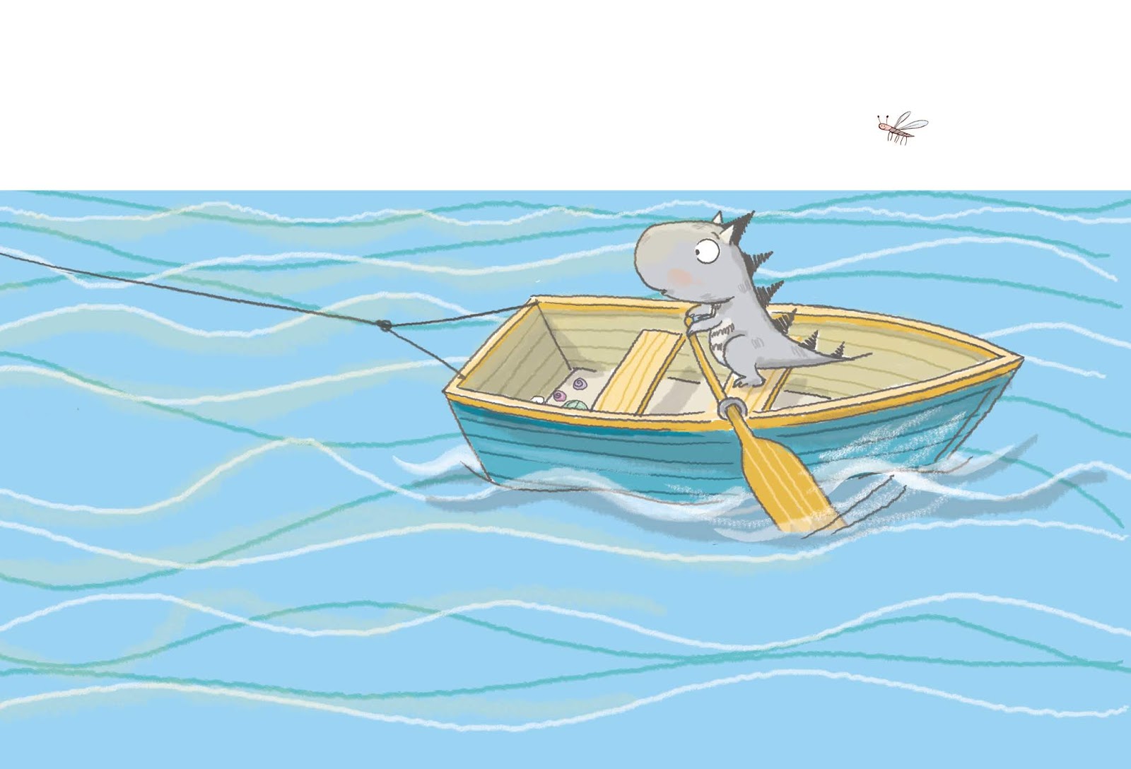
    Excerpt from The Crocodile Who Didn't Like Water
    by Gemma Merino (UK: Macmillan, 2013)
    Close up from A River by Marc Martin (UK: Templar, 2016)
    Close up from There is a Tribe of Kids by Lane Smith (UK: Two Hoots, 2016)
    If you have any thoughts on illustrating water, or know of any great illustration examples, do share. Thanks!
     Paeony Lewis